The Laws of Simplicity
Laws of Simplicity is on my "old but gold" list. A book originally released in 2006 (link to the 2020 edition on Amazon - https://amzn.to/41CaoS4) that remains extremely relevant today.
The text written by John Maeda (https://en.wikipedia.org/wiki/John_Maeda), currently the VP of Design and Artificial Intelligence at Microsoft, is a great ode to simplicity that can be applied to software or even life in general.
But let's focus on software, which is the main topic of this post. The development of applications, with increasing features, ends up making the use complex. Complexity and poor usability push away users and require a significant effort to train them.
The book discusses 10 different laws, but for the sake of simplicity (after all, it's a text about it), I'll comment on the ones I see as having the most value in software development:
Law 1 - Reduce

"The simplest way to achieve simplicity is through thoughtful reduction."
"The easiest way to simplify a system is to remove functionality", but it's not always the case that removing functionality is the way to simplify things. The book presents an interesting concept called SHE:
- (S)hrink
- (H)ide
- (E)embody
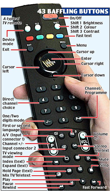
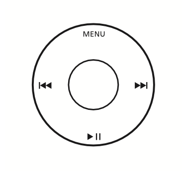
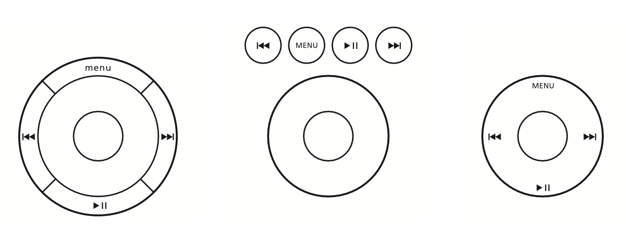
Let's take some examples to apply SHE, starting with a traditional TV remote control:
...and we compare it to the original Apple TV remote:

...or the Google Chromecast one:
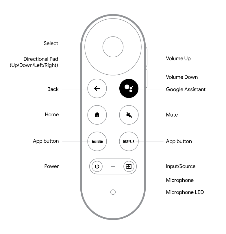
Note that reducing doesn't always mean removing functionalities. As seen in the examples above, the Google TV remote control has the same functionalities as a traditional remote control, but the complexity is hidden from the user, following the principles of Shrinking and Hiding (SHE).
The complexity of the software behind this control is much greater than that of a normal control, with its hundreds of buttons. Notice how much has been "hidden" from the user and how much has been transferred to the software's complexity. Instead of 30 different buttons, you have a small button in which you can speak, and the control will interpret what you want to do.
Want to watch a movie? Just say the name of the movie, and the search engine will interpret your voice, search all streaming platforms for the movie, list where you can watch it, and with one click, you can start watching the movie.
The reduction here was not in functionality but in complexity for the user, who simply speaks, and as if by magic, the TV knows how to find the desired movie. Quoting Arthur C. Clarke in "Profiles of the Future: An Inquiry into the Limits of the Possible" (https://amzn.to/41YRzZb) - "Any sufficiently advanced technology is indistinguishable from magic."
Certainly, removing functionalities is part of the development process, as we often introduce functionalities in software that don't make sense over time and that we should remove. This makes the development process more agile, as we don't need to maintain functionalities that are no longer used by anyone. It also leads us to think about how to measure the functionalities of our software and to always be attentive to adoption/use. This is a topic for a future post.
The Embody (SHE - Shrink, Hide and Embody) is to show the value that this simplified version of your solution has. You need to clearly show your user that this "simplified" solution has more value than the "complex" version. It's about fighting the customer who will buy a TV because its remote control has more functionalities compared to the Apple TV control.
Embody means the perceived quality, the way it is "polished," its presentation. The first MP3 players looked like this:

Clearly, the iPod seems to be a product that was better crafted and made with higher-quality materials (Embody) than others, despite appearing simpler (Shrink and Hide).
Use the "SHE" together. It will be a powerful tool for simplification and adding value to your product.
Law 2 - Organize
"Organization makes a system of many appear fewer.”
Structure your system in such a way that the perception of organization facilitates the user's life.
“Gestalt psychologists believe that there are a variety of mechanisms inside the brain that lend to pattern-forming.” You don't need to read a psychology book (but if you want the reference, it's here - https://amzn.to/3ArLXuC) to understand this concept. Basically, it means that our brain is pre-programmed to understand grouping patterns, and this simplifies interpretation.
Let's take an example: which phone is easier to read?
5555410151
(555)541-0151
Certainly the second one! We grouped and organized the same numbers so that we have greater clarity.
We are good at grouping patterns! Look at the evolution of the famous "joystick dial" of the old iPods -
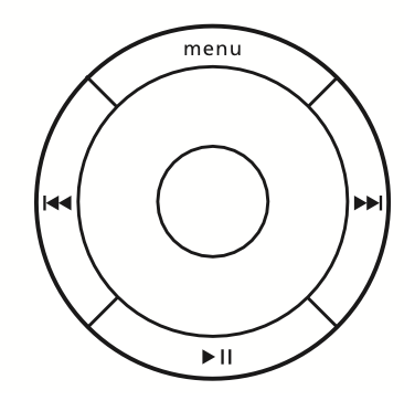
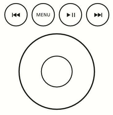
Side by side:
Apple went from a minimalist design that won users (1), to one that increased complexity (2) to a grouping movement (3) that simplified the layout even further. They alternated between the simple and complex and knew how to recognize complexity and come back with an even more simplified design.
Our monkey brains interpret these versions as follows:

Where (3) seems to be a more organized grouping.
A good summary of the Gestalt theme applied to UX can be found here - https://uxplanet.org/gestalt-principles-in-ux-design-2e0f423bfcb5
Law 3 - Time

“Savings in time feel like simplicity”
How to make your software responsive enough so that users don't feel like they're wasting time? Jakob Nielsen wrote that “0.1 second is the response time limit if you want users to feel like their actions are directly causing something to happen on the screen. For example, if you click on an expandable menu and see the expanded version in less than 0.1 seconds, then it feels as if you made the menu open up. If it takes longer than 0.1 seconds for the revised state to appear, then the response doesn't feel instantaneous — instead, it feels as if the computer is doing something to make the menu open.”
We may not always be able to develop an application that has such a fast response time. If it's not technically feasible, we should create mechanisms to hide (back to SHE - Hide) this perception from the user (see ChatGPT's reference at the end of the article). We can use techniques like pre-loading or background processing so that the user doesn't have to wait synchronously for the application to respond.
It's a balance here between "how do I make the application run faster" versus "how do I make the waiting time more tolerable".
Finalizing

Simplicity changes the way your users perceive your software. To cite a very current example, text generation mechanisms have always been complex to operate. ChatGPT came with an extremely simple interface, seeking a conversational model with the user, which brought a human side to the application.
It seems charming the way the response prompt is generated on the screen when you ask a question, word by word, like someone frantically typing on a keyboard on the other side of the world, but believe me, this was initially a performance limitation of the model, which has to predict the next word to be generated. The generation time problem became an attraction because of the way it was presented, making the software humanized. The complexity, which is huge, was reduced, hidden, and incorporated into an interface that won users over.
The power of putting something extremely complex under the hood, seeming like magic.